CoverLineage collection
One iconic cover.
168 interpretations.
Trace the artistic lineage of Todd McFarlane’s Spider-Man #1, from major publishers to the strangest corners of independent comics.
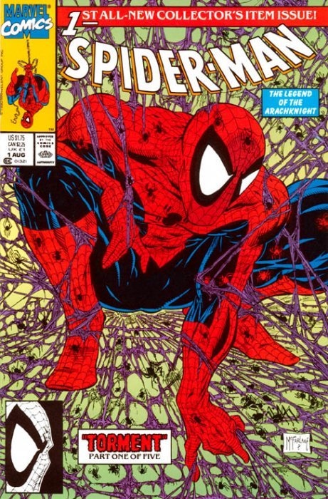
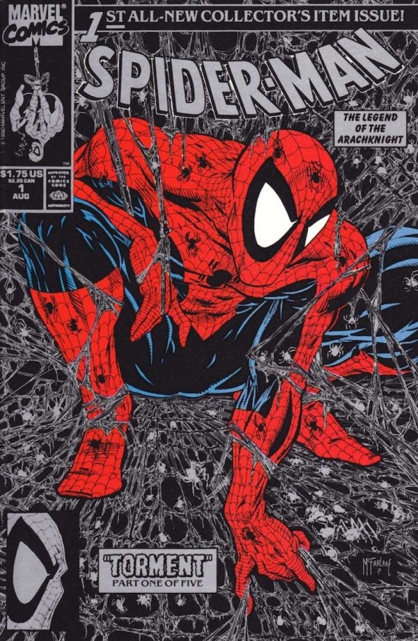
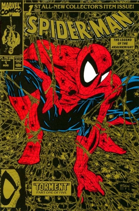
The origin pointSpider-Man #1 (1990) · Primary, silver & gold editions
The original cover
The crouch that became a visual language.
Published by Marvel Comics on August 1, 1990, Spider-Man #1 opened “Torment” with Todd McFarlane credited as writer, penciller, inker, and cover artist.
The cover compresses McFarlane’s Spider-Man into an unmistakable silhouette: a low, elastic crouch held inside a dense field of webbing. The logo, corner box, burst, and “collector’s item” banner make the page feel both like a comic and an event. Those ingredients created a composition artists could quote even after changing the character, publisher, genre, or joke.
It was also designed to be collectible from the beginning. The original release appeared with multiple color treatments—including the familiar green, silver, and gold editions—while preserving the same central drawing. That tension between one iconic image and many physical editions became a pattern the homage market would repeat for decades.
What followed is more than a sequence of Spider-Man references. The pose migrated into superhero comics, horror, humor, licensed properties, crowdfunding campaigns, store exclusives, and self-published work. Each reinterpretation reveals what its artist considered essential: the crouch, the web, the tilted anatomy, the corner-box theater—or simply the instant recognition created when those pieces meet.
CoverLineage counts a new entry when the core drawing changes. Color treatments, trade-dress swaps, virgin covers, foil applications, and other production variants stay attached as related editions. That lets this archive show the true reach of the composition without making one drawing look like several different homages.
Anatomy of the cover
Recognition, compressed into a crouch.
The homages do not need to reproduce every strand of webbing. They become recognizable by preserving a small set of structural signals: the silhouette, the enclosing web, the theatrical trade dress, and the feeling that Spider-Man is coiled tightly enough to spring off the page.
- 01
The impossible crouch
Spider-Man folds into a low, nearly circular knot. One knee drives forward while the other leg sweeps beneath him, turning anatomy into a compact emblem.
- 02
The oversized eyes
Bright, sharply angled lenses remain readable against the red mask and give the otherwise compressed figure an immediate focal point.
- 03
The web as enclosure
Webbing is not background decoration. It radiates around the figure like a trap, a halo, and a frame—visually pinning Spider-Man at the center.
- 04
The event-sized logo
The enormous masthead, collector banner, corner box, and issue number announce a launch designed to feel historic before the reader opens it.
- 05
The inset promise
The lower caption and eye inset tease “Torment” while balancing the upper-left corner box. Later artists often preserve this small block of visual theater.
Lineage Notes
The crouch that became a language.
Read how the McFarlane crouch moved from comics into toys, clothing, skate culture, memes, and film production.
The SM1 collection
Browse the lineage
- Distinct covers
- 169
- Related editions
- 113
Help complete the lineage
Know one we missed?
Collectors, artists, publishers, and retailers can flag a published homage for review. Every suggestion is verified before it joins the archive.
From the community
Show us your collection.
Share how this cover lineage lives on your shelves. Photos and comments are reviewed before they appear here.
Approved community photos will appear in this carousel.
Collector notes
No approved notes yet.
Start the conversation with a story about your own collection.